20 Best Two Colour Combination for Living Room to Try
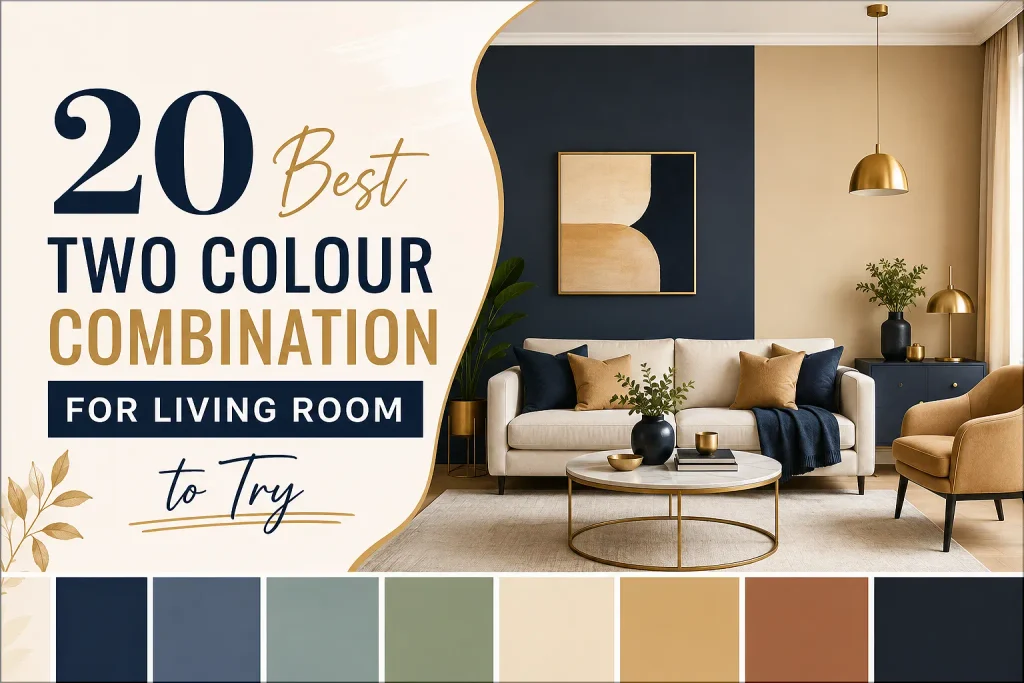
Choosing a two colour combination for living room walls can change the mood of your home without replacing furniture. The right pairing can make a room feel brighter or more structured. Before painting, view samples in daylight and evening light because colour changes with direction, bulbs, flooring, and furnishings 1.
This guide shares 20 distinct living room color ideas, from quiet neutrals to jewel tones. Each scheme helps create a balanced living hall colour palette.
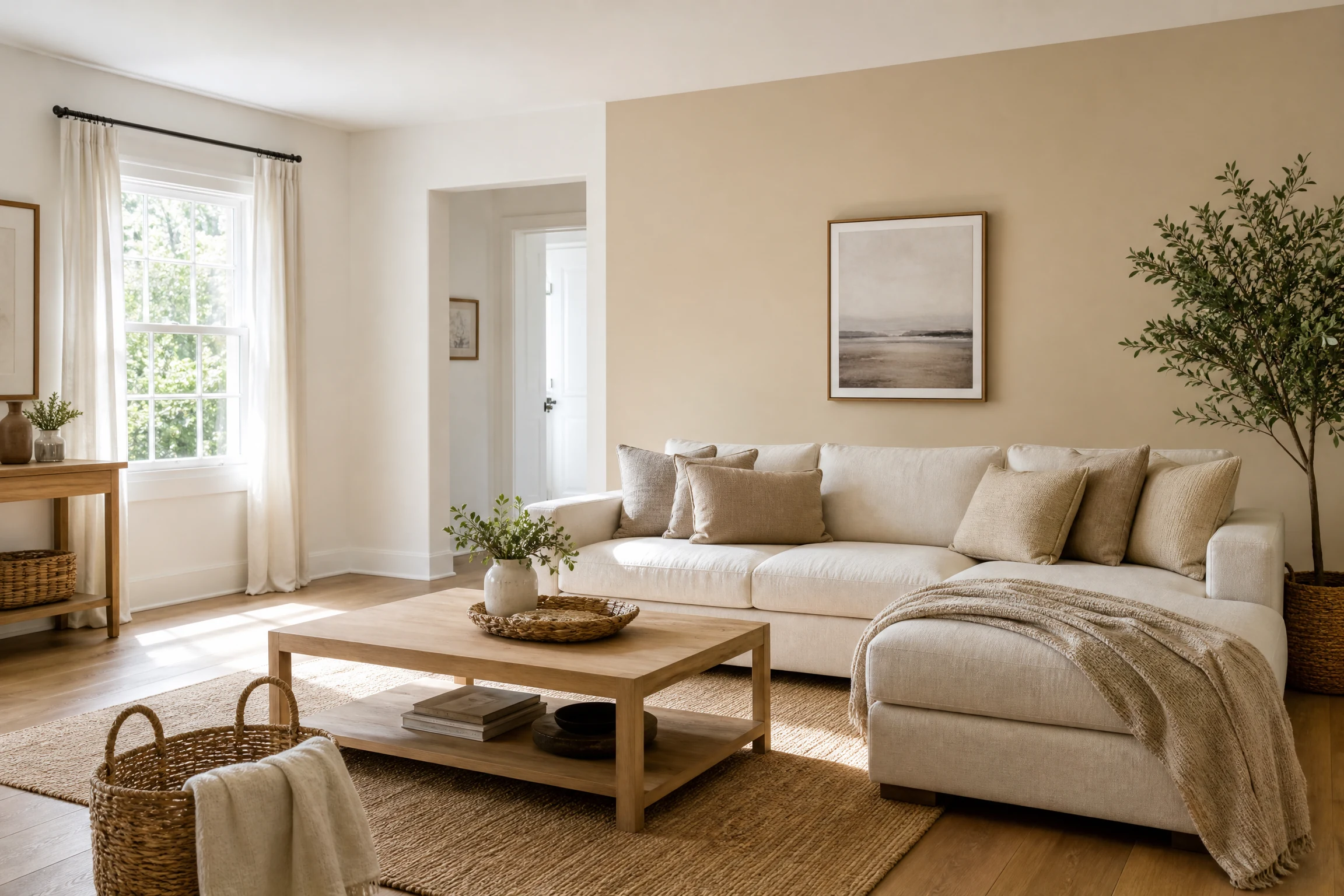
1. Warm White and Soft Beige for an Airy Everyday Room
Warm white keeps the room open, while soft beige adds enough depth to prevent the space from feeling stark. Use white on three walls and beige behind the sofa or television. Linen upholstery and pale oak complete this scheme. It suits small or dim rooms and can be the best color for living room walls in that setting.
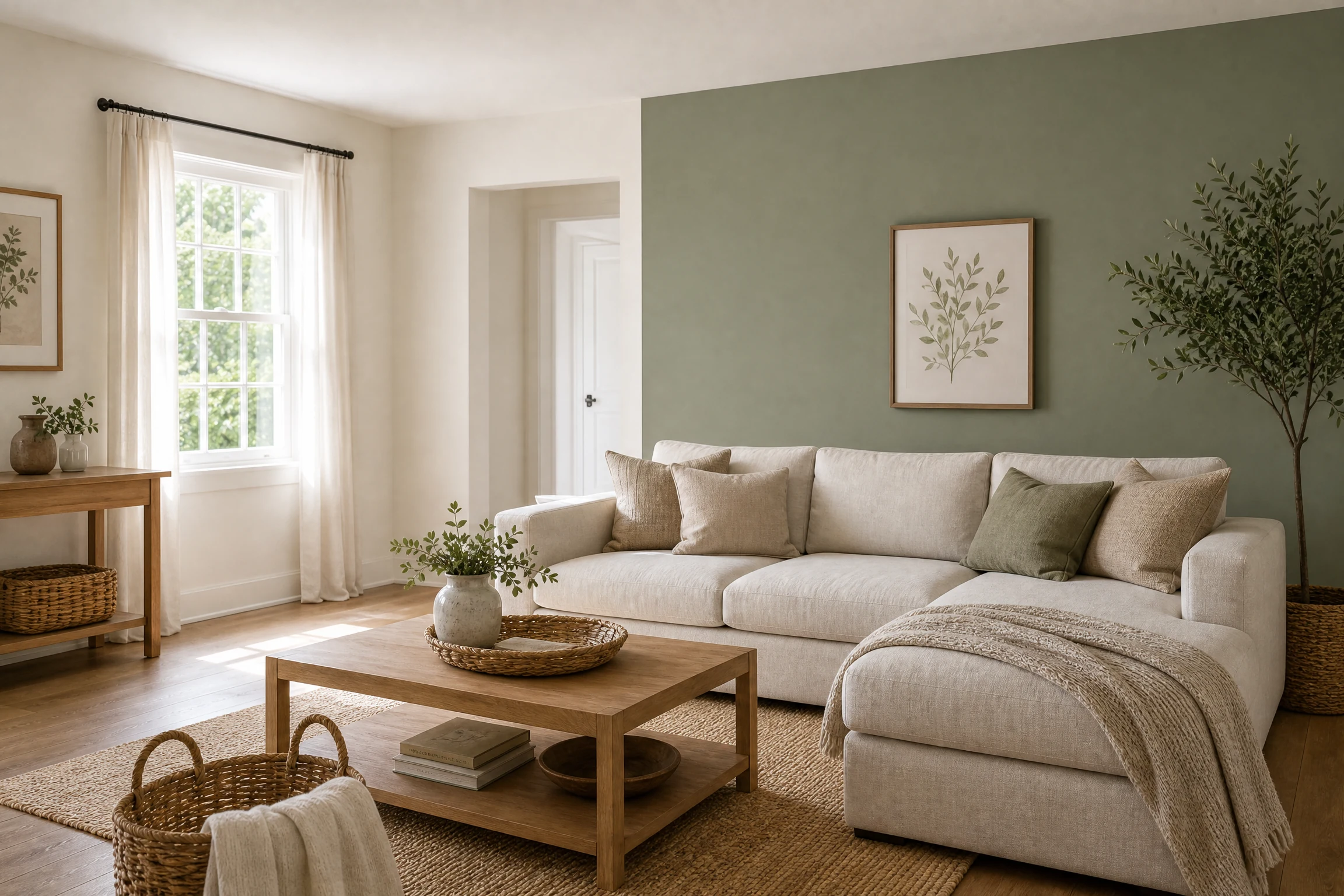
2. Sage Green and Cream for a Calm Nature-Inspired Look
Sage green brings a muted botanical feeling, while cream keeps the palette gentle and luminous. Paint the main walls cream and use sage on a single architectural wall, niche, or built-in. Terracotta pottery and natural wood add warmth.
3. Navy Blue and Crisp White for Tailored Contrast
Navy and white create a classic pairing with a modern edge. A navy feature wall gives a sofa a strong visual anchor, while crisp white on adjacent walls protects the room from becoming heavy. Add brass lighting or tan leather.
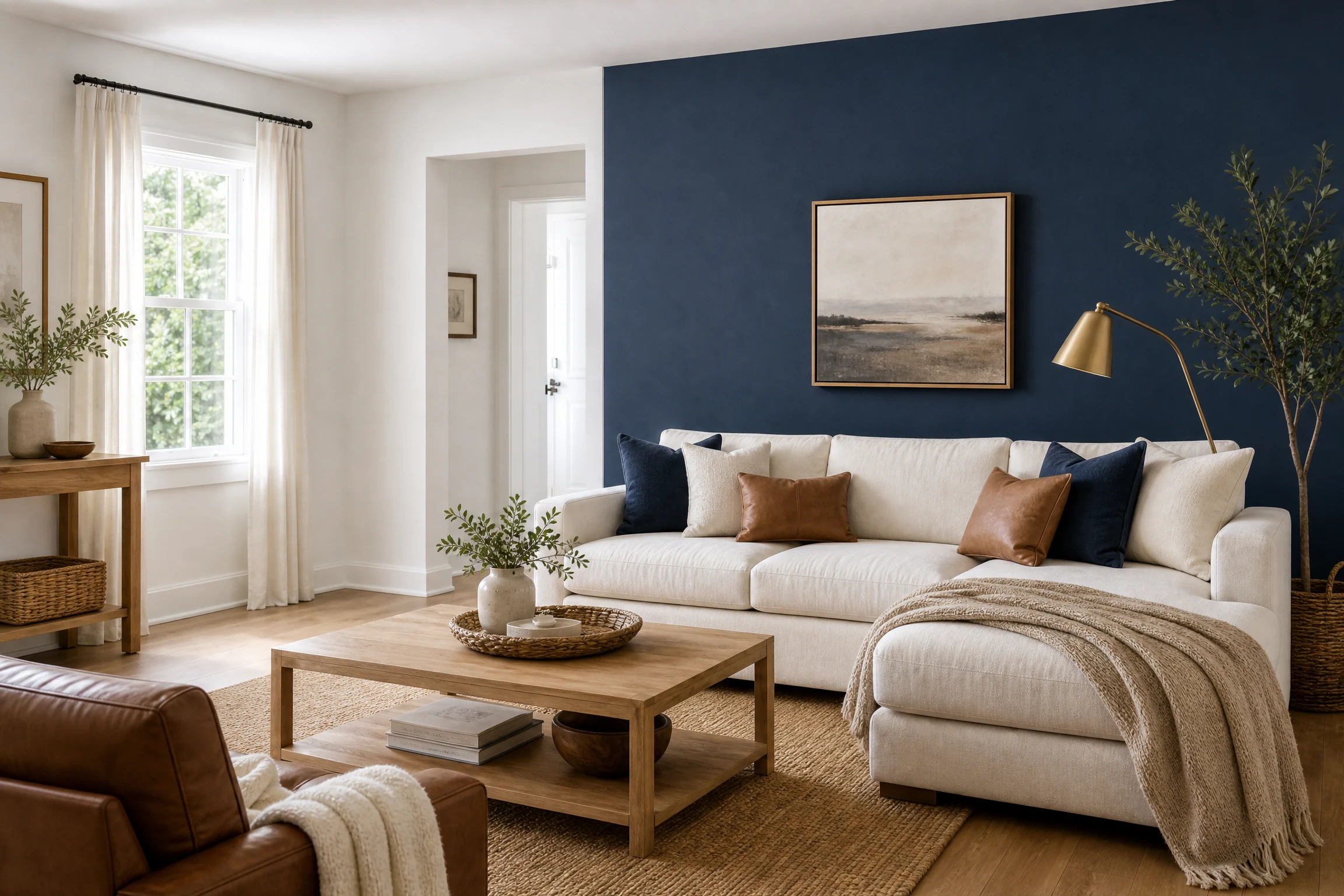
Shopping hook: A navy and white removable wallpaper search on Amazon can help renters test the look before committing to paint.
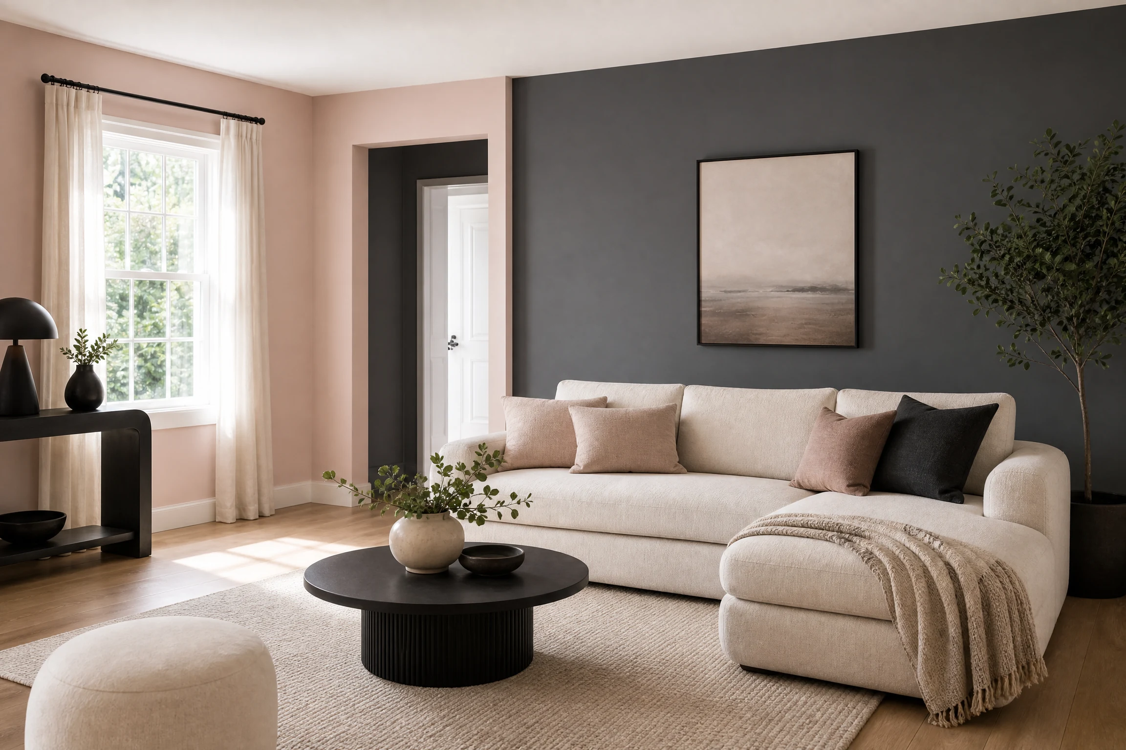
4. Charcoal Gray and Blush Pink for Soft Modern Drama
Charcoal gray supplies depth, while blush pink softens its industrial character. Place charcoal on the focal wall and use blush in a painted alcove or adjacent wall. Keep furnishings simple with cream upholstery and rounded silhouettes.
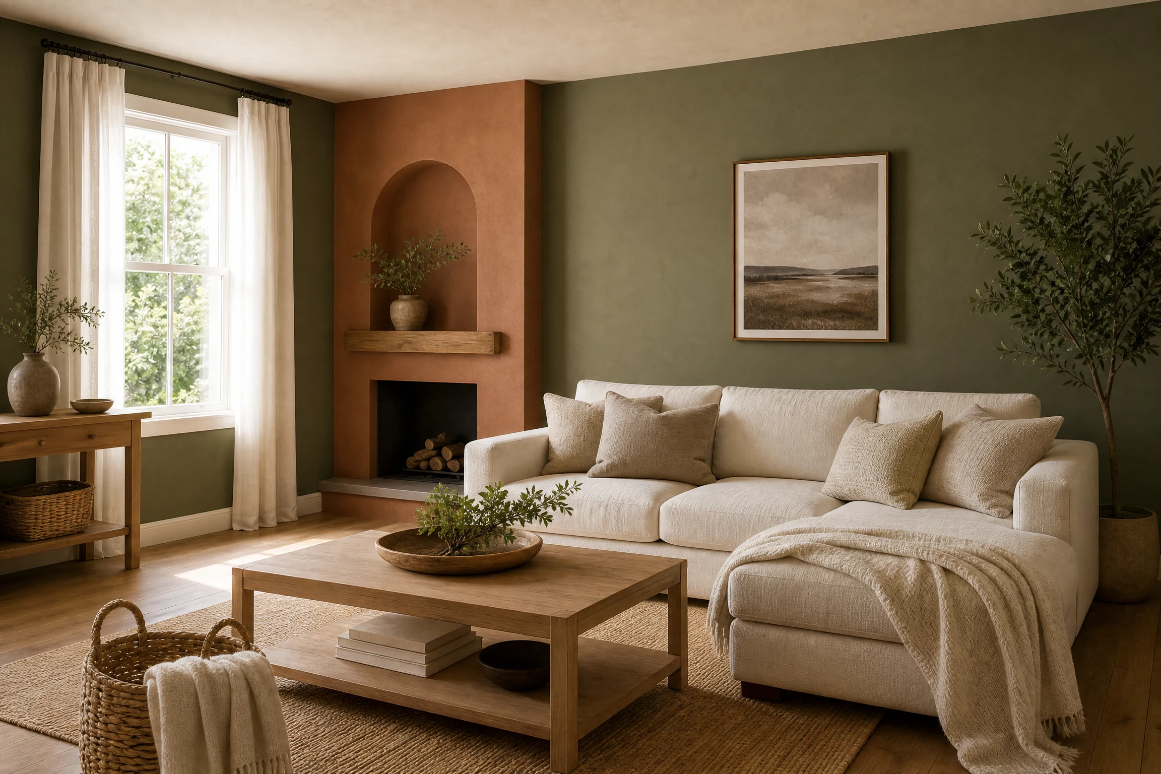
5. Olive Green and Terracotta for an Earthy Conversation Space
Olive green feels grounded and sophisticated, while terracotta adds an inviting clay-like warmth. Use olive as the dominant wall colour and terracotta around a fireplace, reading corner, or low half-wall. Cream textiles prevent the combination from feeling saturated.
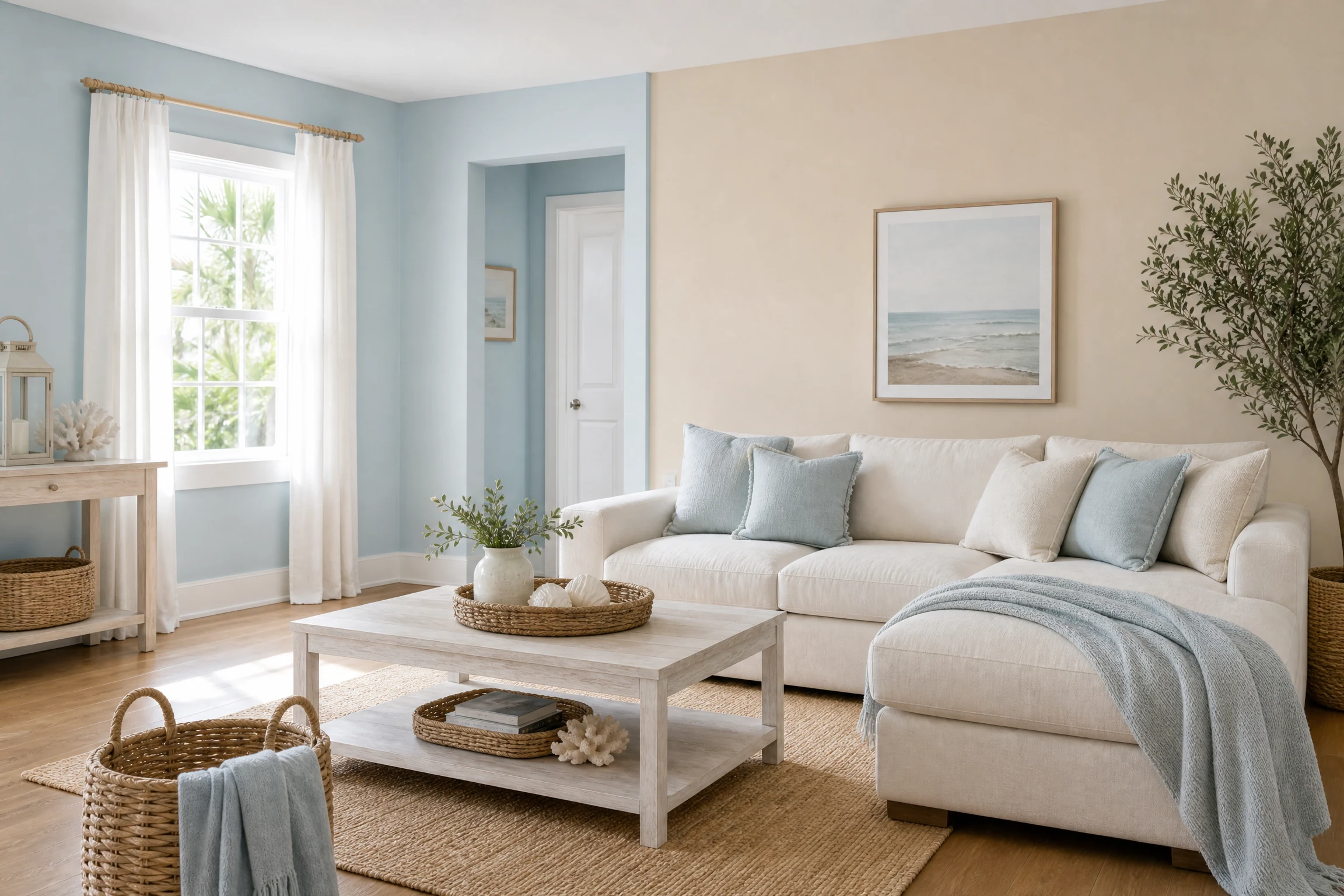
6. Pale Blue and Sand for a Light Coastal Mood
Pale blue and sand work beautifully in rooms with plenty of daylight. Paint the larger wall area pale blue and introduce sand on a shorter wall to visually balance the proportions. Rattan and whitewashed wood support the coastal feeling.
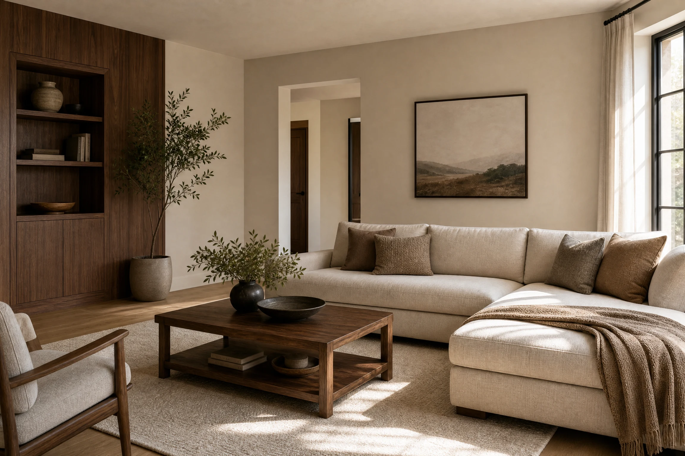
7. Greige and Deep Brown for a Refined Neutral Interior
Greige sits between gray and beige, making it adaptable to both cool and warm furnishings. Pair it with deep brown on a media wall or panelled section for a more luxurious result. Walnut furniture and ivory rugs make this a versatile color scheme for living room styling.
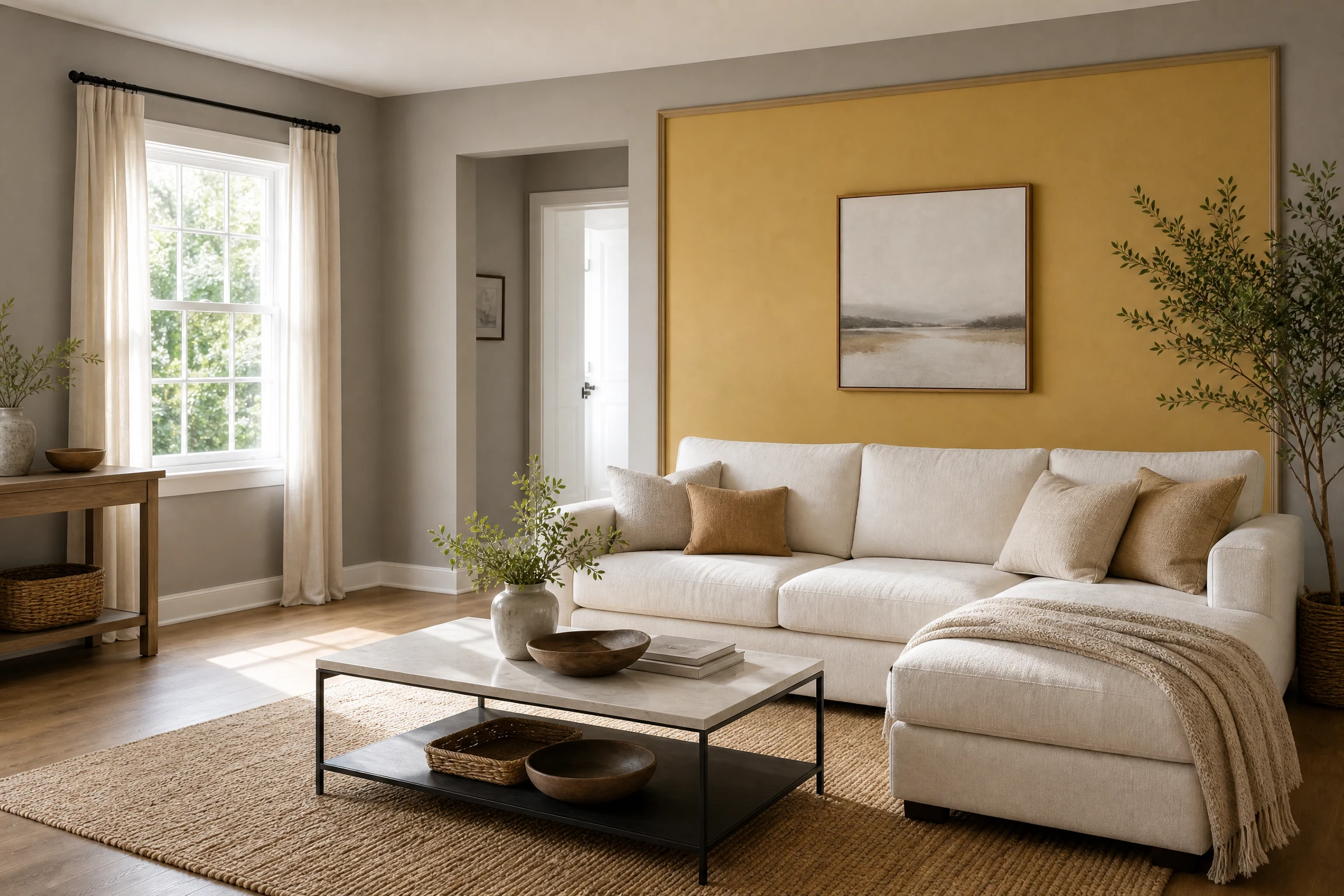
8. Mustard Yellow and Warm Gray for Cheerful Character
Mustard yellow brings energy, while warm gray provides visual control. Rather than covering every wall in yellow, use it on a framed accent, recessed wall, or lower section. Gray seating keeps the result bright but grown-up.
9. Forest Green and Warm White for a Biophilic Statement
Forest green creates a cocooning focal wall, and warm white balances its intensity. This pairing suits rooms with houseplants, leather furniture, and natural textures. A green wall behind the sofa can make the zone feel intentional while white maintains openness.
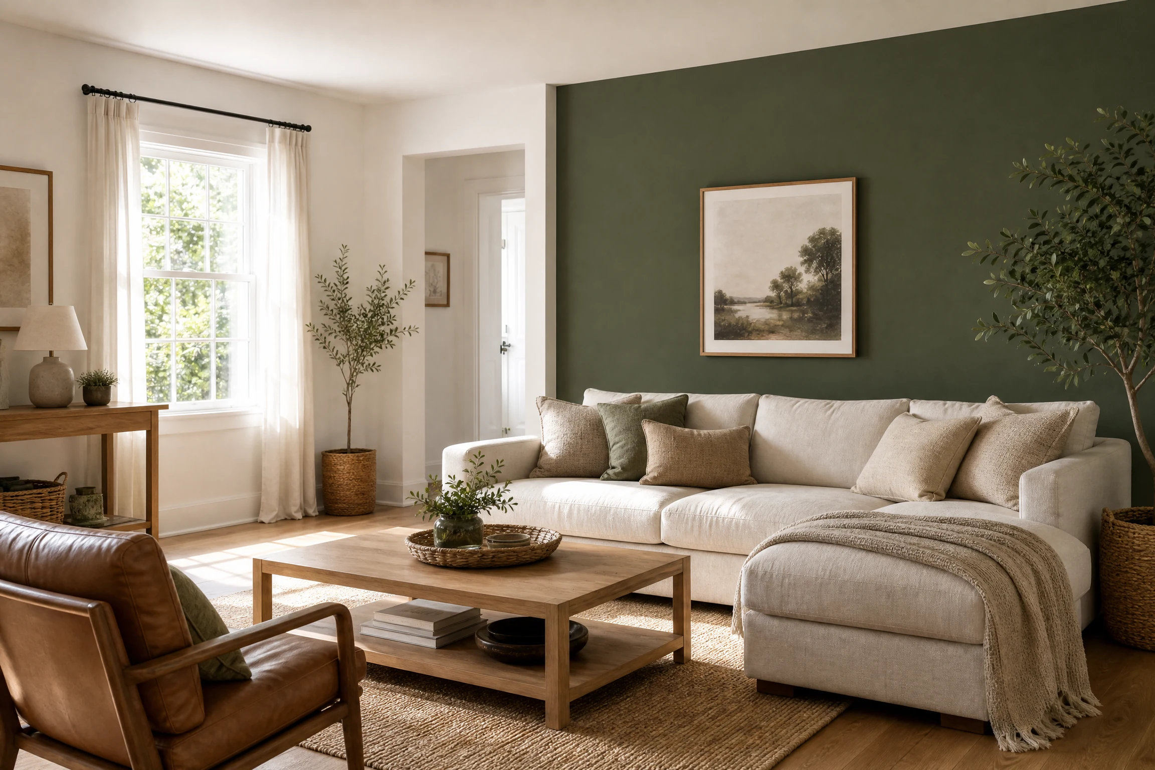
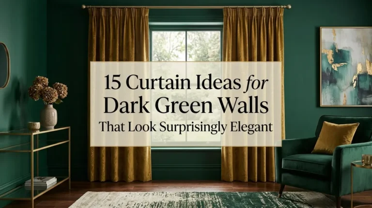
For coordinating window treatments, see these curtain ideas for dark green walls and repeat one small accent colour in the cushions.
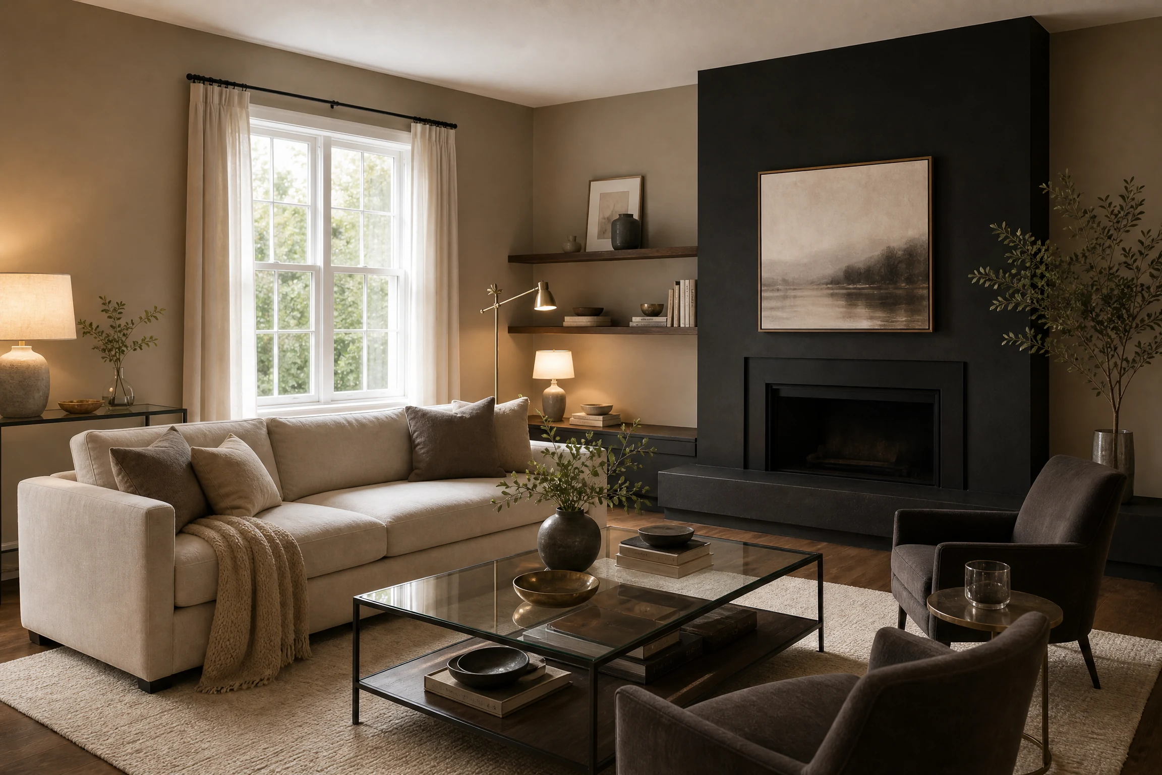
10. Taupe and Matte Black for a Contemporary Statement
Taupe adds softness; matte black adds definition. Use taupe on most walls and reserve black for a narrow TV wall, fireplace surround, or built-in cabinetry. Because black absorbs light, pair it with layered lamps and reflective details.
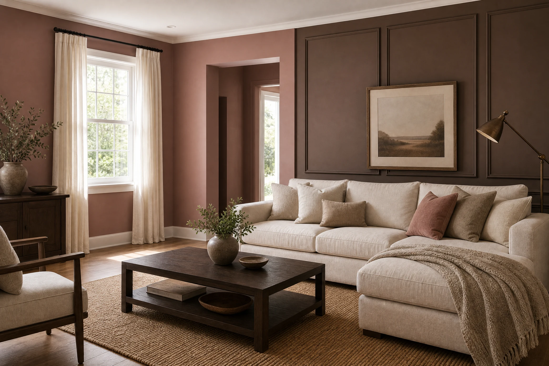
11. Dusty Rose and Mocha for Warm Sophistication
Dusty rose feels elegant rather than sugary when balanced with mocha brown. Place dusty rose on the main walls and mocha on a panelled feature wall or lower dado section. Cream artwork, dark wood, and aged bronze create a welcoming palette for evening entertaining.
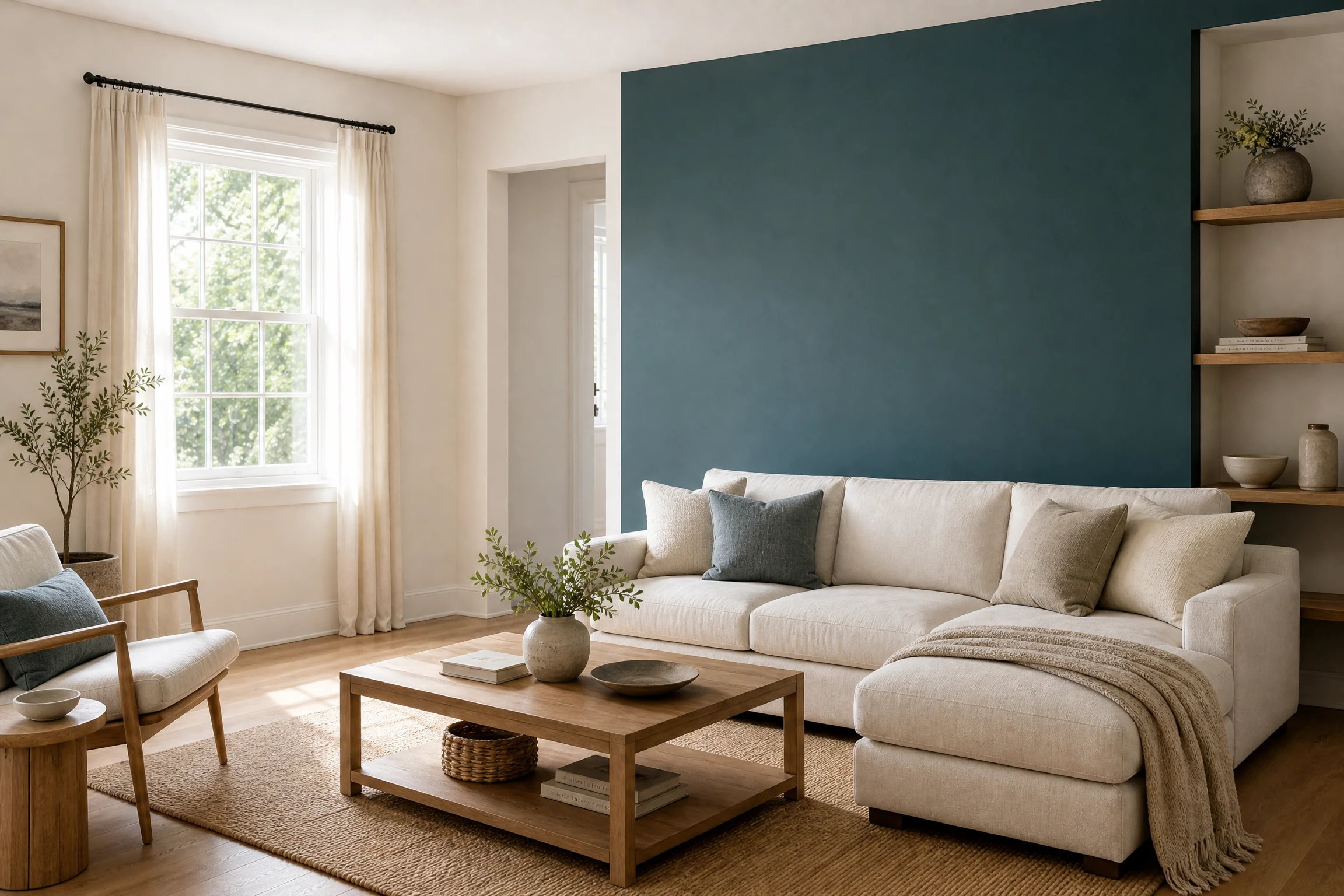
12. Teal and Ivory for an Expressive Modern Room
Teal gives the living room personality, while ivory keeps the scheme usable every day. A teal wall behind open shelving becomes a backdrop for ceramics and artwork; ivory walls on the remaining sides help distribute light. Keep accessories restrained so the colour remains the feature.
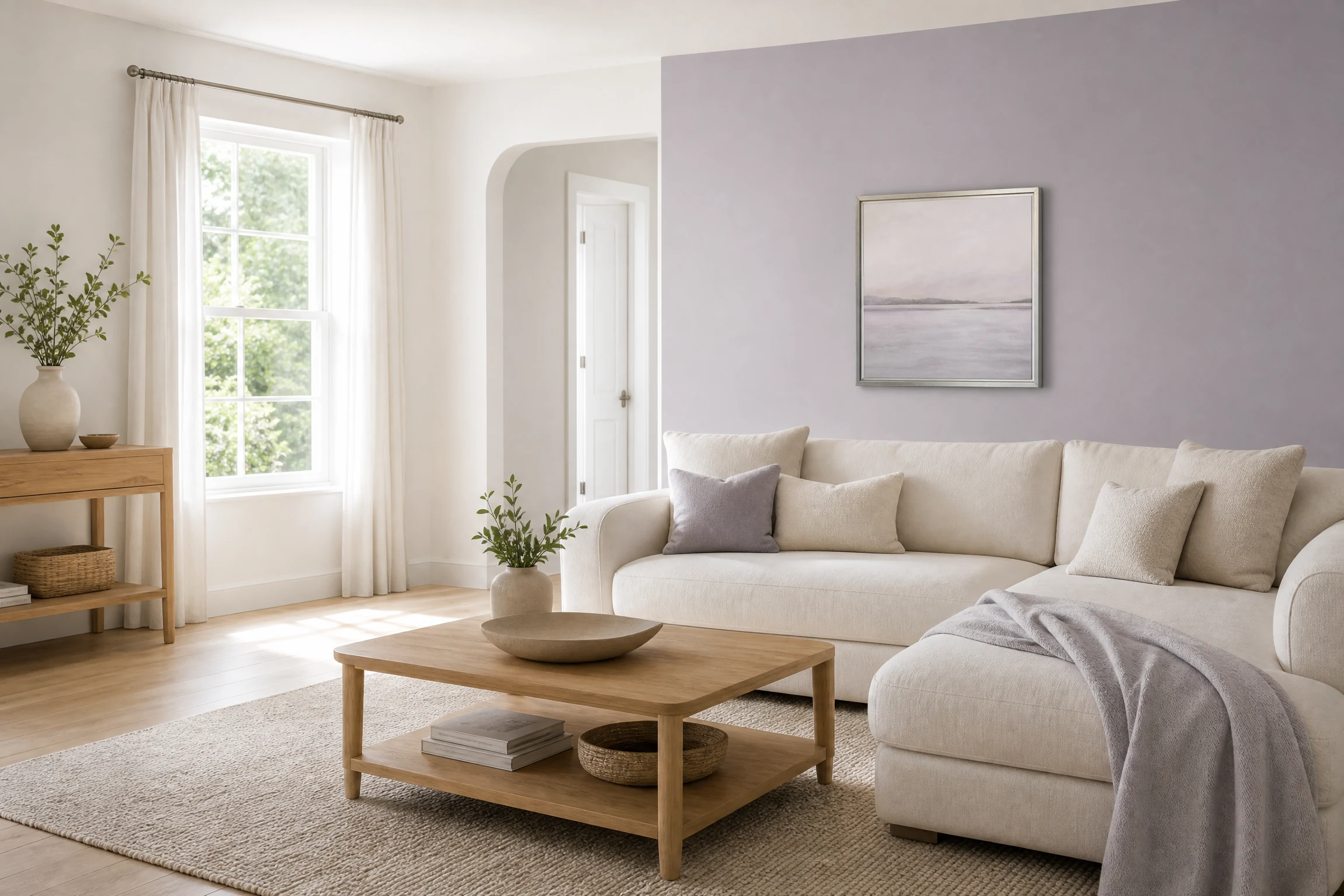
13. Lavender Gray and White for a Quiet Contemporary Palette
Lavender gray is a subtle alternative to ordinary gray. Combine it with clean white on the ceiling, trim, or one adjacent wall for a fresh look. Pale wood and silver-toned hardware reinforce the cool, airy character without making the room feel cold.
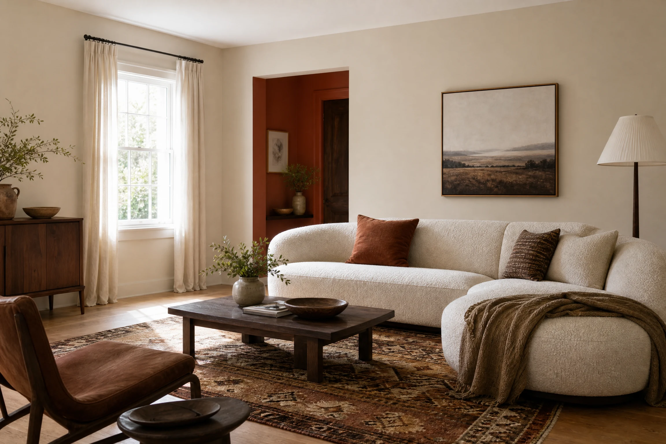
14. Rust and Pale Greige for a Collected Designer Feel
Rust is rich and energetic, while pale greige provides a calm background. Apply rust to a compact feature wall or alcove and pale greige to the larger surfaces. Add cream boucle, patterned rugs, and dark wood for an editorial look that still feels comfortable.
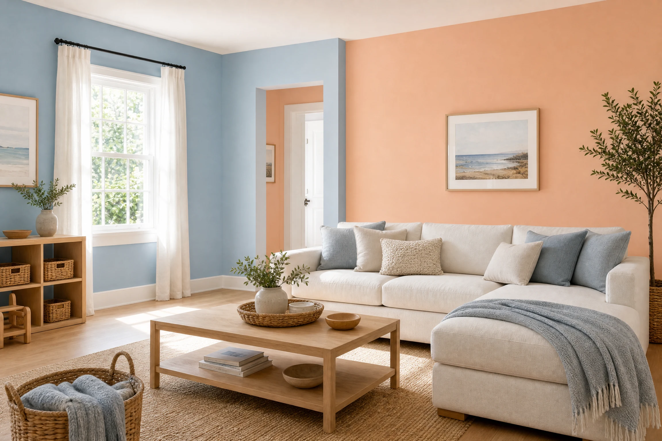
15. Powder Blue and Peach for a Friendly Family Room
Powder blue and peach create a cheerful but gentle room when both colours are slightly muted. Use blue on the main walls and peach around a window seat or built-in. Light oak and washable fabrics make the scheme practical for family use.
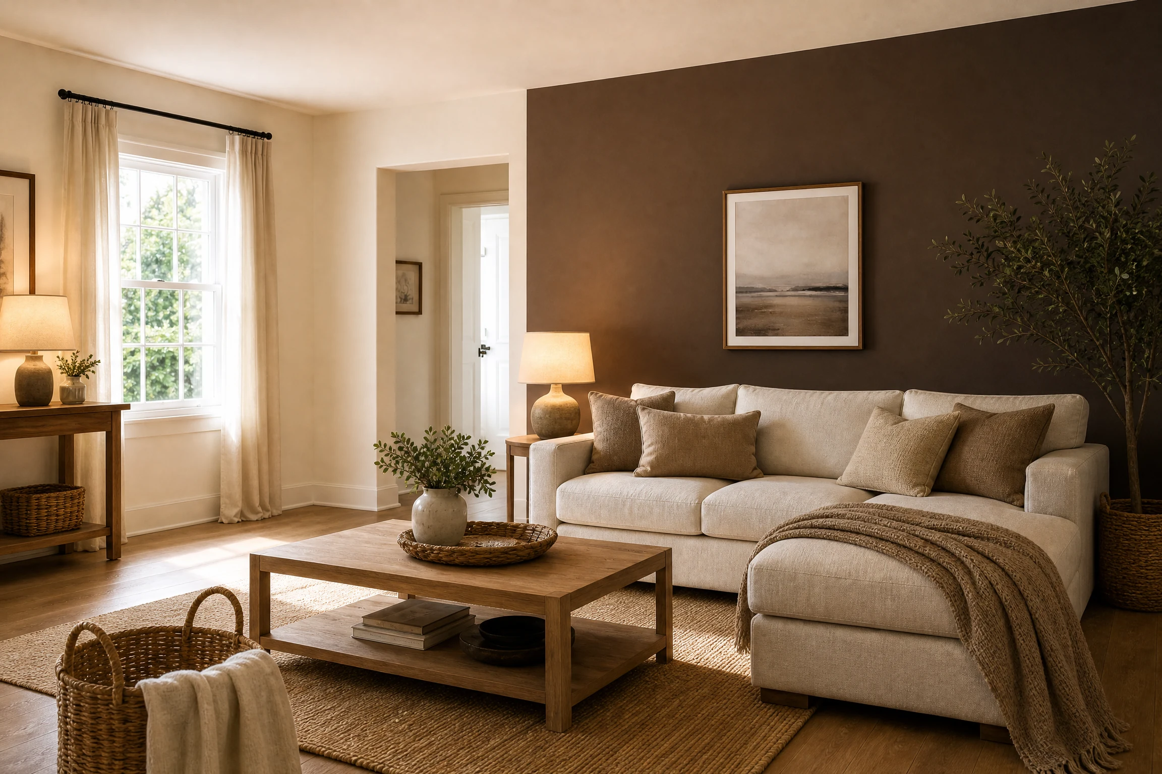
16. Espresso Brown and Pale Cream for Cozy Luxury
Espresso brown gives a large room a grounded, intimate feeling, while pale cream prevents it from appearing enclosed. Try brown on the longest wall and cream on the others. Layer warm lighting and a large rug to soften the contrast.
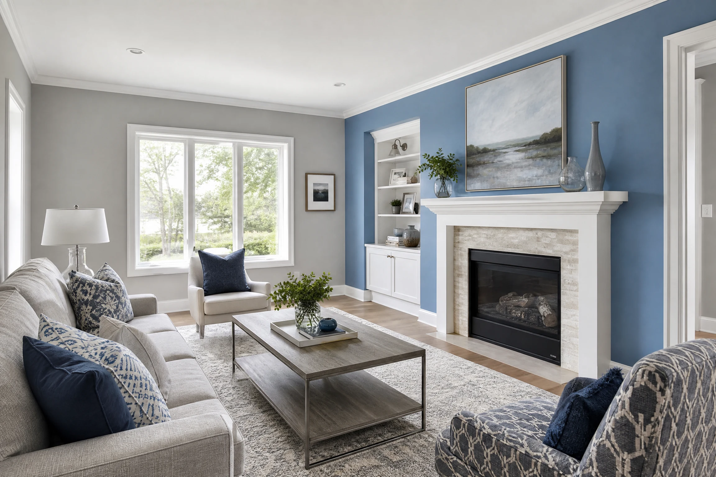
17. Cornflower Blue and Soft Gray for a Fresh Transitional Style
Cornflower blue has more character than a basic pastel, and soft gray makes the pairing feel tailored. Use blue on a fireplace or sofa wall and gray elsewhere. White trim and patterned cushions connect the shades.
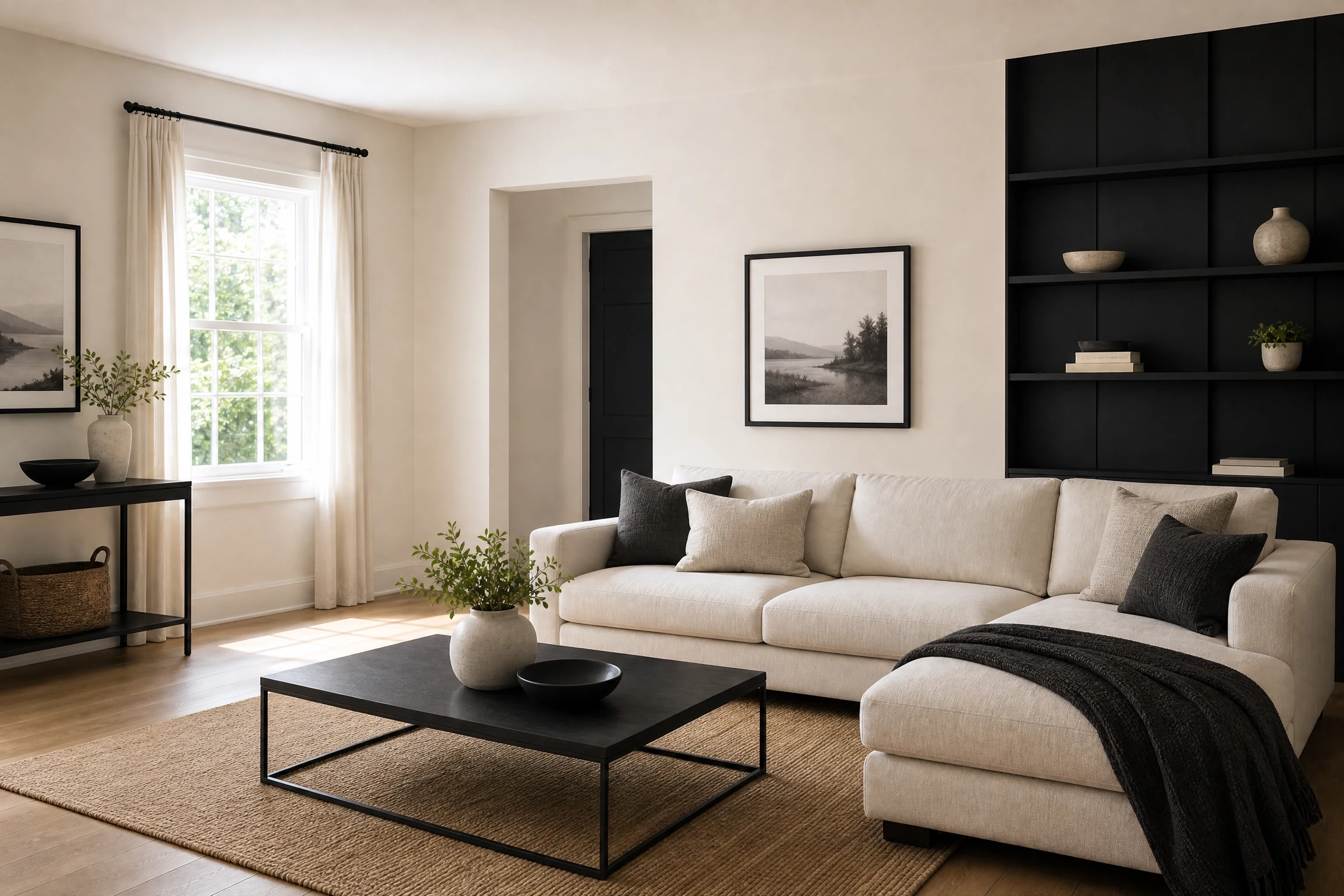
18. Black and Warm Ivory for Graphic Minimalism
Black and warm ivory are ideal for a high-contrast modern two colour combination for living room walls. Use ivory broadly and black selectively on a geometric panel, shelving wall, or fireplace zone. Repeat black in frames and lighting so the accent feels deliberate rather than random.
Shopping hook: Try a black textured peel-and-stick wall covering on Amazon for a temporary feature wall.
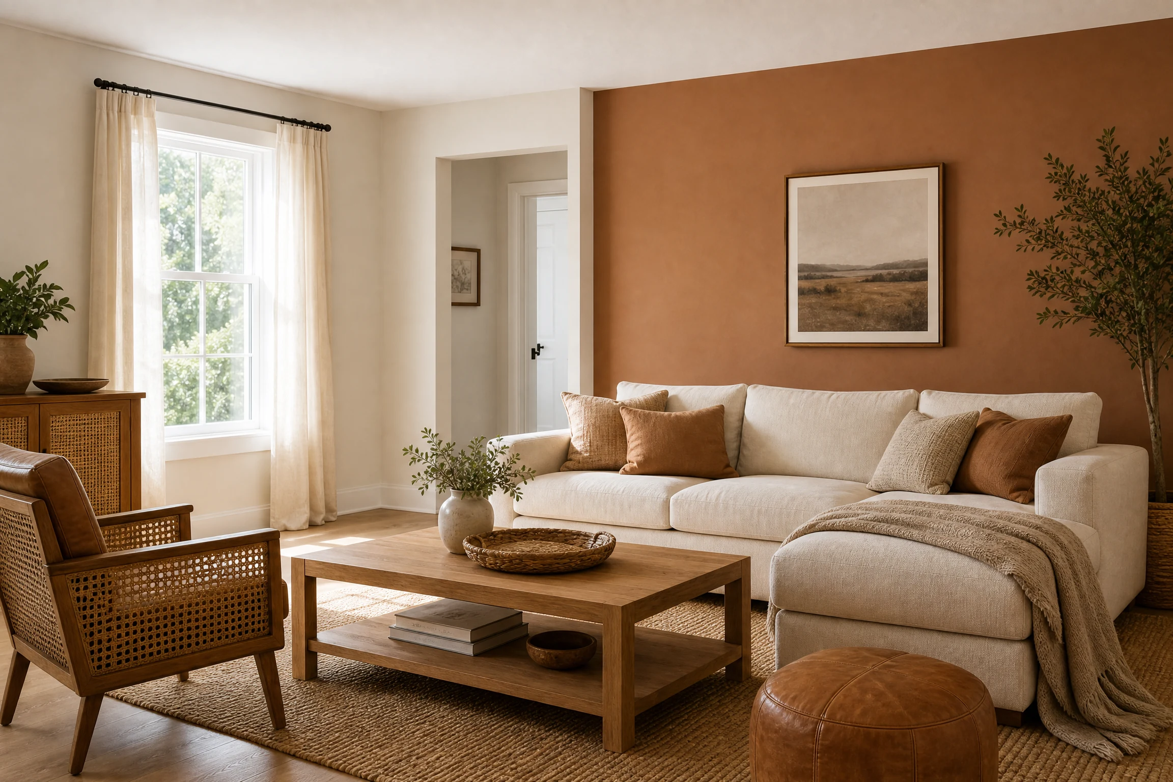
19. Cinnamon and Muted Cream for an Inviting Living Hall
Cinnamon introduces a warm, spicy undertone that works especially well with leather, cane, and medium wood. Use it on one wall or below a chair rail, then balance it with muted cream. The result is a welcoming living hall colour scheme.
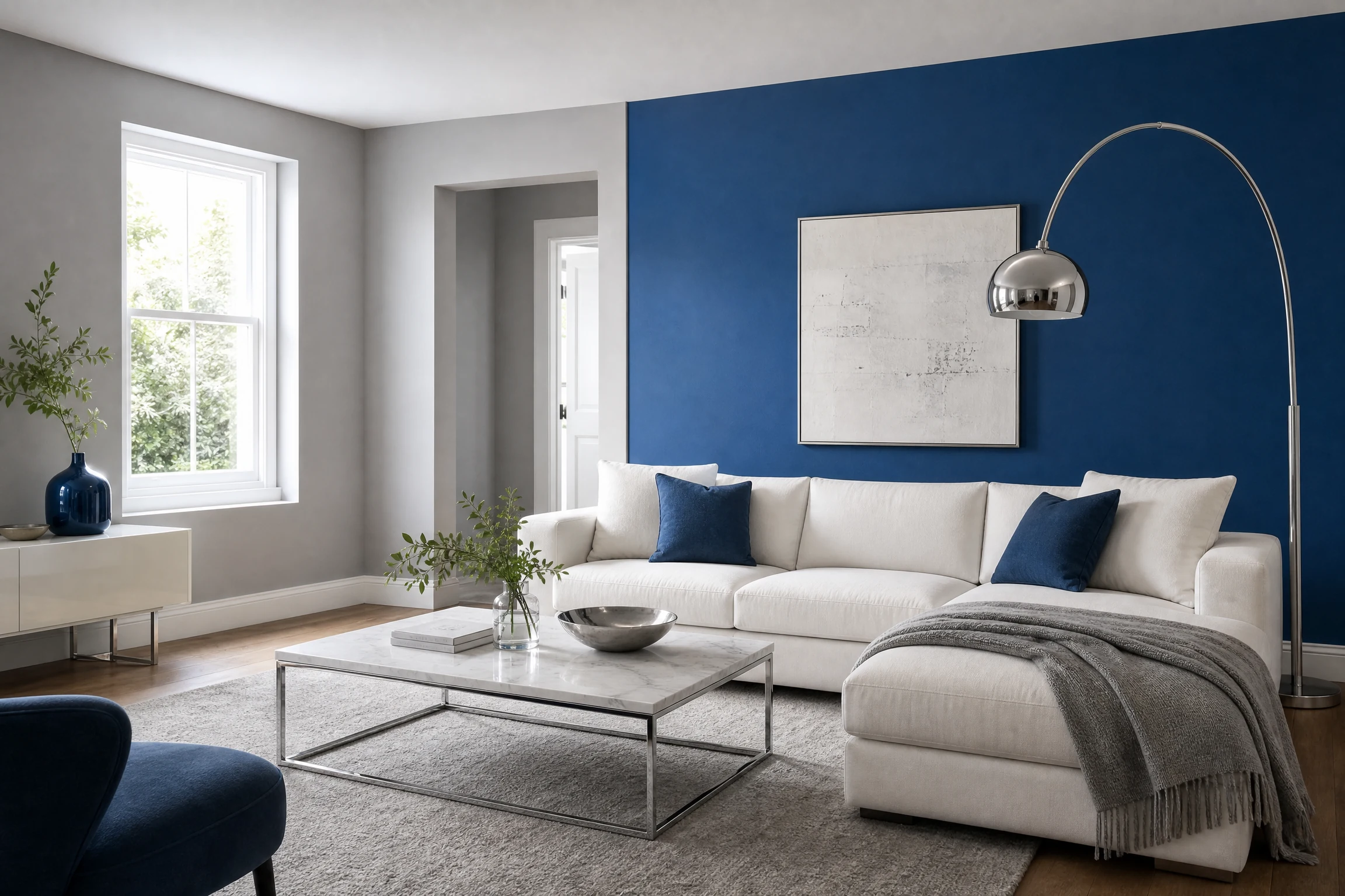
20. Cobalt Blue and Soft Gray for Bold Contemporary Energy
Cobalt blue is confident and graphic, so it works best as a controlled accent. Paint one wall cobalt and use soft gray around it to create breathing room. White art, chrome, and low-profile furniture keep this dual color two colour combination for living room styling crisp and current.
Shopping hook: A large neutral living-room rug on Amazon can visually connect a bold wall to the rest of the furniture.
How to Choose the Right Two Colour Combination
Start with natural light, fixed finishes, and purpose. Warmer companions suit darker rooms, while sunny rooms can handle cooler or deeper accents. Use the 60-30-10 principle flexibly: one colour dominates, the second defines a feature, and accessories repeat accents. Always sample both shades on the actual wall and observe them at different times of day 1.
For rental homes, use removable wallpaper, fabric panels, art, or furniture to introduce the second colour without permanent changes; these damage-free rental decorating ideas can help. For a long blank wall, see how to decorate a long wall before deciding where the accent should stop.
Final Thoughts
The best two colour combination for living room walls is the one that supports your room’s light, furniture, and daily mood. Choose one dominant shade, give the second a clear job, and repeat both colours through textiles or accessories. Thoughtful sampling can make a simple paint update feel finished.